Pennsylvania Academy of Fine Arts
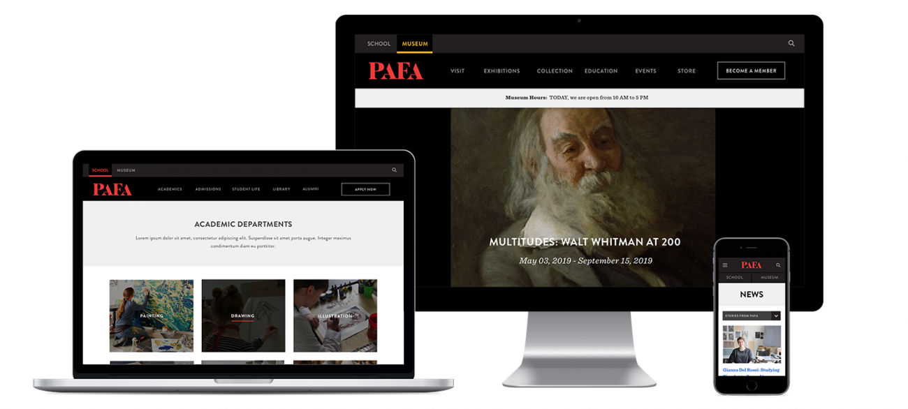
Message Agency's primary goal for the redesign of this art college website was to streamline user journeys across multiple key audiences. We conducted an analysis of user behavior, heuristics, and best practices and recognized that a site with two “front doors” was a better approach.

Webby Award Winner for School/University Website, 2020
The Challenge
Leadership at this renowned fine arts college had grown frustrated with their previous site, which had an attractive design but failed in many other aspects, particularly site organization, information architecture, and performance. Site administrators found the site very difficult to update, and many of the features intended to streamline back office functions failed to deliver. End users found it challenging to navigate the site, which had to address the needs of a wide range of stakeholders, from students to adults and their children taking classes, to museum visitors. PAFA asked Message Agency to address these various challenges with a redesign that kept the spirit of the original visual design but fixed the issues that were plaguing the site.
A Tale of Two Audiences
One immediate goal was to tackle the sites’ convoluted navigation structure. The original site had an overwhelming mega-menu that attempted to cover every aspect of PAFA’s varied activities and audiences. We conducted an analysis of user behavior, heuristics, and best practices and recognized that a site with two “front doors” was a better approach. The needs across student and non-student users had very little overlap, so we designed a site with two home pages—one at pafa.org for museum and community program audiences, and one at pafa.edu for students. Content can still be shared across both environments, and a tabbed meta-navigation allows visitors to easily jump from museum to school without dissonance. Each “site” has its own streamlined navigation that caters to the needs of each audience.
A Flexible Architecture
Another key challenge was a proliferation of content types in ways that complicated site administration. Content types were used to create page elements, layouts were highly stylized but inflexible, and site administrators were unable to create new layouts to meet emerging needs. We evaluated the content types and taxonomy, consolidated or deprecated many, and developed layouts that were entirely flexible, allowing site administrators to customize how they presented information on the home page, landing pages, and other templates.