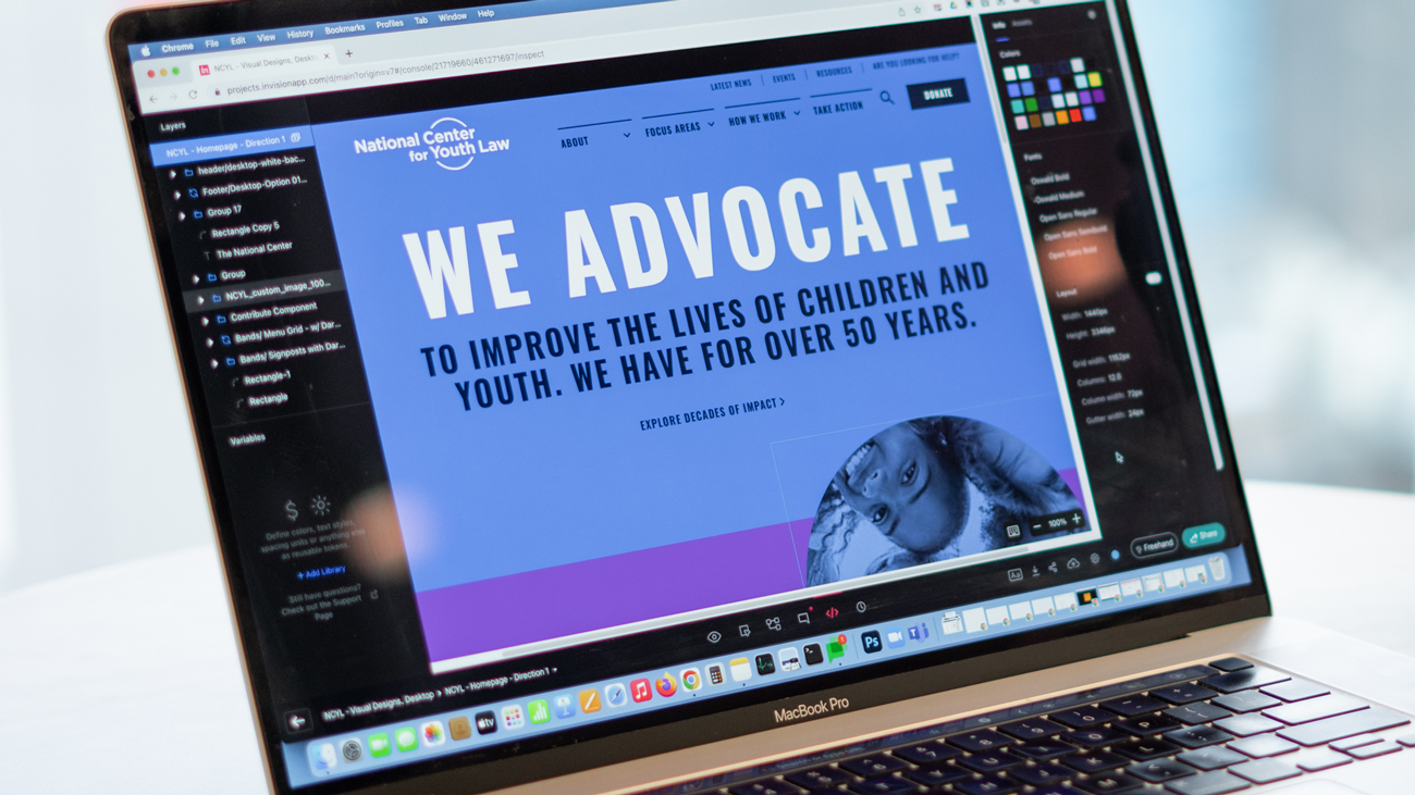
National Center for Youth Law
Recognition
The National Center for Youth Law website was honored with four w3 Awards:
Gold: Activism Website
Silver: Law and Legal Services Website; Best Structure and Navigation; and Children/Youth Website
National Center for Youth Law (NCYL) has a 50-year history of protecting the rights and welfare of children, and reforming the systems that affect them. NCYL is the only national organization focused exclusively on children and youth and all of the systems that they engage through a fully comprehensive strategy: impact litigation, policy work, capacity-building, direct services, education, and empowerment.
With their 50th anniversary on the horizon, and a rebranding project underway, NCYL came to Message Agency looking for a partner who could redesign their website, understand and implement their new brand, and attract and engage new audiences while still meeting the needs of their existing users.

The Challenge
Once solely focused on improving the condition of young people who were involved with the juvenile justice system or in foster care and in confinement, NCYL’S mission is now more expansive. The organization focuses on improving and reforming the systems that impact the lives of young people, explicitly seeking to dismantle systemic policies and practices that are structurally racist and biased.
NCYL has a long legacy of impact and making a difference in the lives of young people; however, their work and impact wasn’t reflected on their website. Our challenge was to determine how to tell their complex story in a way that would engage multiple audiences, help stakeholders understand what problems NCYL is working to solve, and demonstrate how NCYL’s expertise can be a resource for anyone passionate about centering youth in their advocacy or practice. Another challenge was improving how to define a new primary audience, donors, and how to be inclusive to them in our strategies.
Lastly, we needed to address the complexity of the many needs of their internal team members with respect to the existing business process.
Our Approach
Breaking Silos with User-Centered Design
Before NCYL’s redesign, their site attempted to meet the needs of their audiences in siloed sections, which garnered limited engagement. Our approach was to help our partners think about their organization’s identity, mission and impact from their user’s perspectives so we could develop site architecture, content strategy, and visual design that meets the needs of all their stakeholders and partners through an issues- and impact-driven framework.
By shifting the focus to issues and impact, it is possible to motivate the new audiences NCYL sought to engage with—donors and supporters—without leaving behind other key audiences, such as professional advocates and policymakers who depend on NCYL for resources and information.

Lead with the message
It was mission critical to educate the public on who NCYL is as an organization and the impact they are making as the leading children’s advocacy group in the U.S. We leveraged a flexible homepage design that allows the organization to display a custom message about NCYL. Site managers can unpublish that message at any time to promote something timely or urgent, such as breaking news about a relevant case.
We used the organization’s focus areas (education, foster care, health, immigration, commercial sexual exploitation, and youth justice) to drive information design and content strategy to ensure users would be able to quickly understand what NCYL does and navigate through their areas of focus with ease. Users can visit any of the focus area pages and see a list of content related to that particular focus area, such as success and impact stories, NCYL initiatives, events, legal advocacy and impact litigation, laws and policy, press coverage and resources. When uploading any content to the site, site managers just have to tag the content with the relevant focus area and it will automatically populate on the focus area page.
One goal of this redesign was to establish the NCYL as a go-to place to get resources for youth and families to judges to lawyers and advocates. Users can find resources related to each focus group on that dedicated focus area page, also developing a resource library was an important feature to be considered. Users can search by focus areas, audience type, initiatives and location to find relevant resources.
For existing audiences, it was important to maintain access to legal cases and improve the legal docket user experience. Now, key information is easy to find on each case page, such as case status, filing date, case type, location, case jurisdiction, court bane, as well as any other related content items. We also established relationships for the user journey to aid their continued experience of exploring the work NCYL does and support the most up-to-date impact they have made. Case pages display press coverage of that specific case, related initiatives, cases, as well as laws and policy.
Learning the existing platform and the nuances around internal stakeholder needs was a challenge in itself and required a thorough discovery for both the UX designers and the NCYL team. The platform was dated, rigged to find work-around solutions, and inhibiting the NCYL staff’s productivity. Establishing a new platform was the easy solution but presented many challenges for migrating the wealth of content NCYL has established over their 50 years. Careful content re-architecture, thoughtful content strategy around framing, and well documented migration translation were reviewed by all necessary stakeholders. This planning and migration effort provided a clean start for NCYL to both keep their hard work and improve their workflows moving forward.
 Impact
- Improved internal capacity, control, and flexibility with a new content management system
- Defined a clear strategy for the internal team to present their complicated work efforts and impact to a new primary audience
